We live in a world overcrowded by logos. They surround us everywhere we go. From the advertisements on the underground, the packaging your food comes in, even on the toothpaste tube in your bathroom. Logos are everywhere!
The main role of a logo is as the identifiable face of a business. An appropriately designed, memorable logo does this very well and can give clues about the business. But is a logo alone enough to communicate all the complex messages that make up a businesses identity and ethos? If the logo is the face then the brand is the personality.
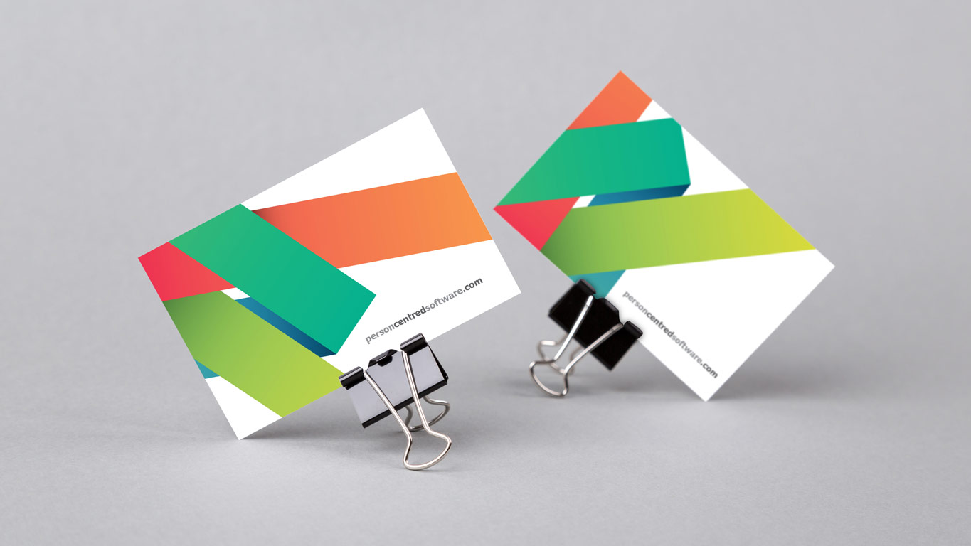
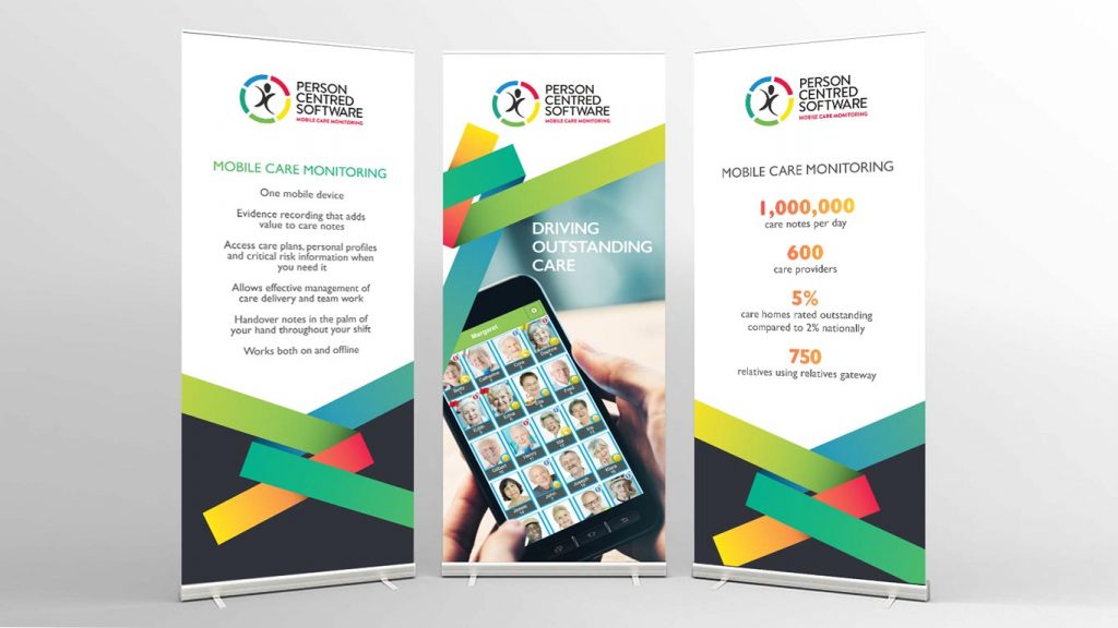
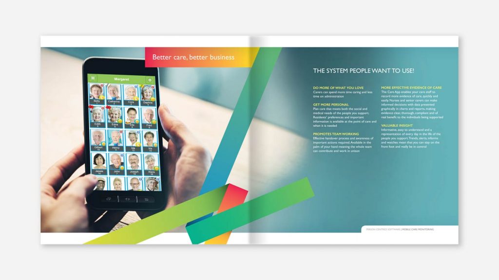
A brand is so much more than just a logo. It’s a company’s personality and philosophy represented in its tone, imagery, typography, logo, strapline, illustrations, colours, textures, graphic devices and the way a business communicates with its clients. It’s an experience that should be felt through every aspect of a business even if that’s just its visual identity – business cards, stationary, websites, brochures, exhibition materials, flyers or simply on social media. Consistency to the way the brand is presented is key to non verbal communication.
When Person Centred Software approached us to design a brand refresh that would be a catalyst for their brand development, we proposed a graphic device amongst other things. They already had an already established logo which wasn’t going to change so the device was the perfect solution to develop a memorable identity they could build their business on.
The device we created included the logo colours but in a much more subtle, graduation style. We designed a ribbon as it evokes feelings of care and union with its subtle subconscious association with charitable organisations. The ribbon device reinforces their vital care message and reflects their growing presence in the residential care home market. Its flexibility offers great potential for the brand moving forward and is able to be used in many different ways across their whole plethora of marketing materials.
Several other brand elements were created as part of the brand refresh. These consisted of the use of human based imagery, subtle ‘pillow soft’ background, specific typography, use of colour and styling.
All of these elements together refined and reinforced Person Centred Software’s purpose and created a style that was recognisable to them. Having not touched the logo in any way and developing a visual identity in the form of a variety of other visual elements, we have confirmed that a brand is much more than just its logo.


