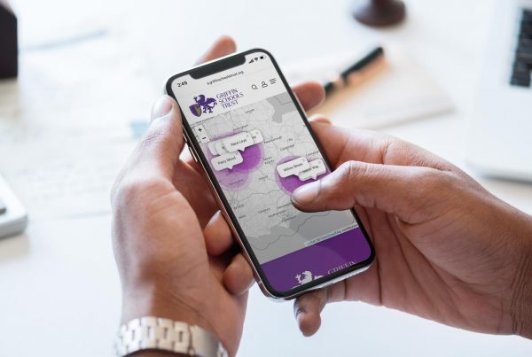
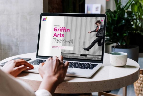
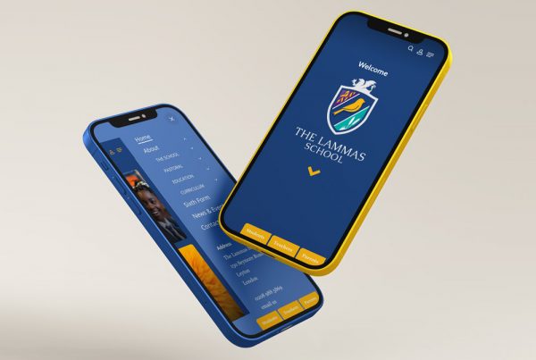
A friendly and creative
Graphic design agency
You have arrived at this page because you searched for ‘graphic design agency’ on google. That’s great, because you found us! What’s next? Well now that you have found us you can relax, you’re in safe hands. We are an excellent graphic design agency.
We are ready to develop beautiful intuitive graphic design with you.
FURTHER READING
Graphic design agency
The basic principles of graphic design
First of all graphic design is not just about creating something that looks beautiful. There is much more to this creative skill than meets the eye. Design is a way of thinking. Design involves a meticulous thought process and holistic approach. As a result graphic design solves a problem.
Typography, photography, illustration, colour and clear space are used to create visual communication. These are communicated using various graphic design programmes. A graphic design agency molds the written and unwritten messages to create a visual experience.
In summary
Graphic Design is all around us. It is important when used in business. It conveys a clear message about a brand or product.
There are many principles to design. Understanding them is essential in business. First of all design is something that not only looks professional but also solves a problem. This results in communicating the correct message. Below we discuss some of the basic principles of design. We also look at how these can be influenced using the specific techniques and skills of a graphic design agency.
BALANCE | for stability and structure within graphic design
During the process of any successful piece of graphic design it’s a must to ensure you have visual balance. There are two main schools of balance: Symmetrical and Asymmetrical. Designers typically create grids as guidelines to help with visual placement when developing a design layout.
Symmetrical design
In symmetrical balance both sides of the page are of equal weight visually. This may be through type, shape, colour, line or many other elements.
Asymmetrical design
With asymmetrical design, elements in the design are deliberately imbalanced. As a result are not evenly distributed. One side may feel heavier or lighter than the other. This can create tension with the reader and sometimes movement. Above all, this directs the viewer’s eye towards the focal point or single element of a design.
HIERARCHY | for organisation and direction
Hierarchy within graphic design means creating an order of importance to the elements. This directs the reader’s attention and makes the information easy to digest. In addition, it is intrinsic to design and how a designer tells a story. As a result, making the information accessible and interesting. Therefore holding the readers’ attention.
Graphic design agency savvy
There are a number of ways a graphic design agency can establish visual hierarchy within text. For instance, using different type sizes, weights and styles. Similarly, a more simple method is using different colours of the same font. This helps the reader know what is more important. The reader instinctively knows where to look and what to read first. In conclusion, it communicates what they should pay more attention to.
Hierarchy isn’t just limited to text. There are many tools available to designers to create hierarchy: Size; position; negative space; colour; hue; contrast; repetition and alignment.
CONTRAST | to generate impact and highlight important areas
Contrast is eye-catching and occurs when two elements are different. Used regularly in graphic design, it creates focus an organisation. Although your first thought may relate to colour contrasts such as light vs dark or warm vs cold, don’t stop there. Size, value, type, texture, shape, alignment, direction and movement also achieve contrast.
Contrast is more than just opposites like black and white or large and small. All of these elements work together to help achieve the final design. Therefore it’s important to remember to balance contrast. To sum up, this adds to a design’s visual interest without it becoming confusing. As a result, directing viewers towards the focal point.
Note
Elements that are related don’t necessarily have to be positioned right next to each other. In summary, they can be connected visually instead of physically.
REPETITION | for uniformity and strength
In graphic design, repetition is the reusing of similar design elements throughout a design. This can include consistent use of a graphical style or language. It can be recognisable in many forms. For instance through a colour scheme, selection of typefaces, shapes, patterns, alignment, photography style and so on.
These conscious decisions create uniformity within a design and brand. Consequently, creating a memorable experience for the reader. Repetition ties individual parts or pages together. In sort, strengthening the design.
Important
It is important therefore, not to confuse repetition with the repetition of visual elements such as a pattern. Although used in graphic design, pattern is concerned with visual style rather than repetition for consistency and uniformity. A good graphic design agency will help you understand this.
ALIGNMENT | to create sharper, clearer graphic design
Alignment within graphic design creates order, organisation and a ‘sharper’ finish to design. Aligning text, images and other elements allows a graphic design agency to create visual connections. Therefore helping bind and unify them into a cohesive structure.
There are two basic alignment principles. Firstly ‘edge alignment’ and secondly ‘centre alignment’. Edge alignment positions the outer edges of elements against an invisible margin. Therefore aligning their sides. Centre alignment positions elements along their centre axes. Thus lining up their middles.
Typographic alignment
When aligning text there are four types of alignment. Firstly, centre alignment (anchored down the centre). Secondly, left alignment (aligned to the left hand side). Thirdly, right alignment (aligned to the right hand side) . Finally, Justified alignment (anchored evenly between two lines).
NEGATIVE SPACE | to define boundaries and bring balance to graphic design
Negative space is instrumental in creating great graphic design (and design for print). Space gives emphasis and hierarchy to elements. A graphic design agency can group or separate them. Therefore improving overall legibility. For example, space within a financial review or business report can really make a difference. Therefore, making vast amounts of information easy to digest.
Graphic designers and typographic spacing
Negative space can enhance type as well. Designers often adjust the leading (vertical space between each line of text). They also adjust kerning (space between two letters/characters). Another element is tracking. Tracking is similar to kerning but instead looks at the space between groups of letters. This can be within a whole word, sentence or paragraph. These adjustments will be small, but they have great impact on how something appears.
Summary
There are definitely some key, basic principles discussed above that work together with the fundamentals of graphic design. Typography, shape, imagery, colour, layout, line, texture, form, size and space are just some of these. They influence how something looks and therefore how it communicates.
As a graphic design agency we use a range of tools. These are both by-hand and digital tools that help us design and construct a whole array of materials. From websites to brochures to business stationery and logos.They all follow the basic principles of graphic design. We are a graphic design agency near Guildford. We are not freelance designers.
The value of design agencies.
Good design far outweighs it’s cost. Download this report from The Design Council of England. It explores the relationship between client and designer. It highlights the demand for design in business. You might also also like to read this article on the impact of design. Our government use the same principals of design. Principals that align with our own.


