

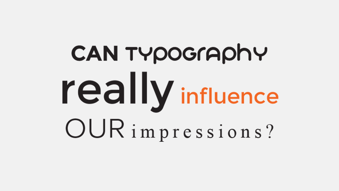
Typography can be very influential to readers without them really knowing how or why they feel what they’re feeling when reading something. Whether it’s on the web or read across design for print, typography is a very powerful tool to designers.
With developments in web and print , it is clear that striking imagery drives a large proportion of design. However, we shouldn’t forget typography is the cornerstone that pulls all of the design together.
Content is the most crucial and valuable component of any website or document. It is the reason people visit and return to a site, pick up and read a book or brochure and although aesthetics in graphic design play a large part, its role holds a supporting secondary position.
Typography is the art of displaying content and many factors, such as colour, typeface, type size, alignment, hierarchy, and line spacing play an influential part in a users/readers experience. Below we look at these factors and explain how they might have an influence over how we feel and therefore perceive it.
Colour
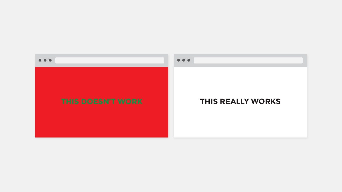
Colour has a very large influence over how we feel and how we may perceive something. For example when we think of the colour red, many may associate that with danger, anger, love or passion. When we think of blue we could feel cold, trust, competence or fear. Green may evoke feelings of nature, envy, freshness and so on.
Colour must work in harmony with typography to gain its maximum results. It’s no good if you have great content but the type colour and the background have a head-on clash with one another. Stark contrasts between colours make for an easy read and will keep readers engrossed.
Typeface
Using certain typefaces can also have a large influence on the reader. These influences can be linked to culture and specific uses. A serif font like Times New Roman may feel recognisable and traditional to readers because they have seen this particular font used across printed material for centuries; like newspapers for example.
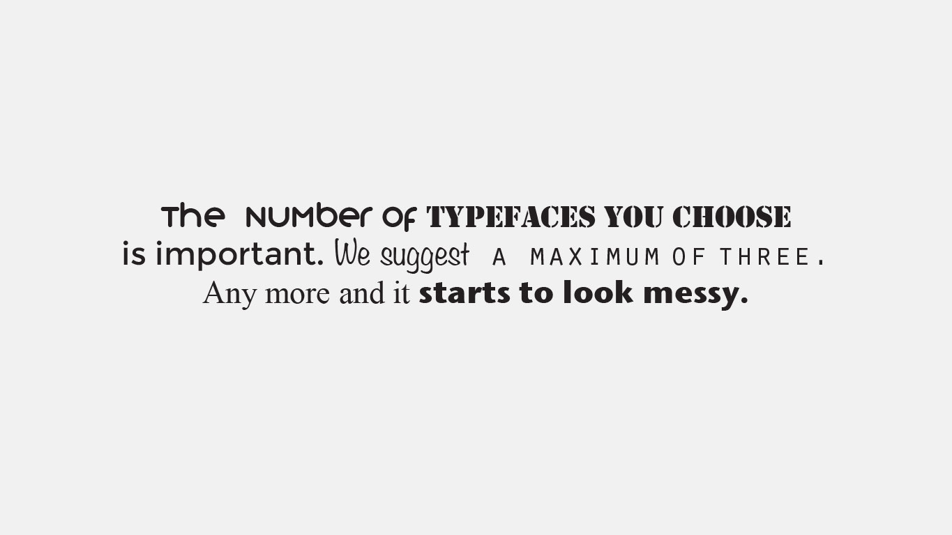
Typefaces give off different feelings based on their appearance and usage. Serif fonts are traditional, stable and respectable; Sans Serif fonts are simple and sensible, whereas Decorative fonts are fun and casual. Using a Decorative font in content for a legal firm would not get across the intended message of the business correctly. Choosing a typeface depends largely on the message you’re trying to convey. We suggest limiting your typefaces to a maximum three because it can aid hierarchy and tone without compromising the readability.
Type size
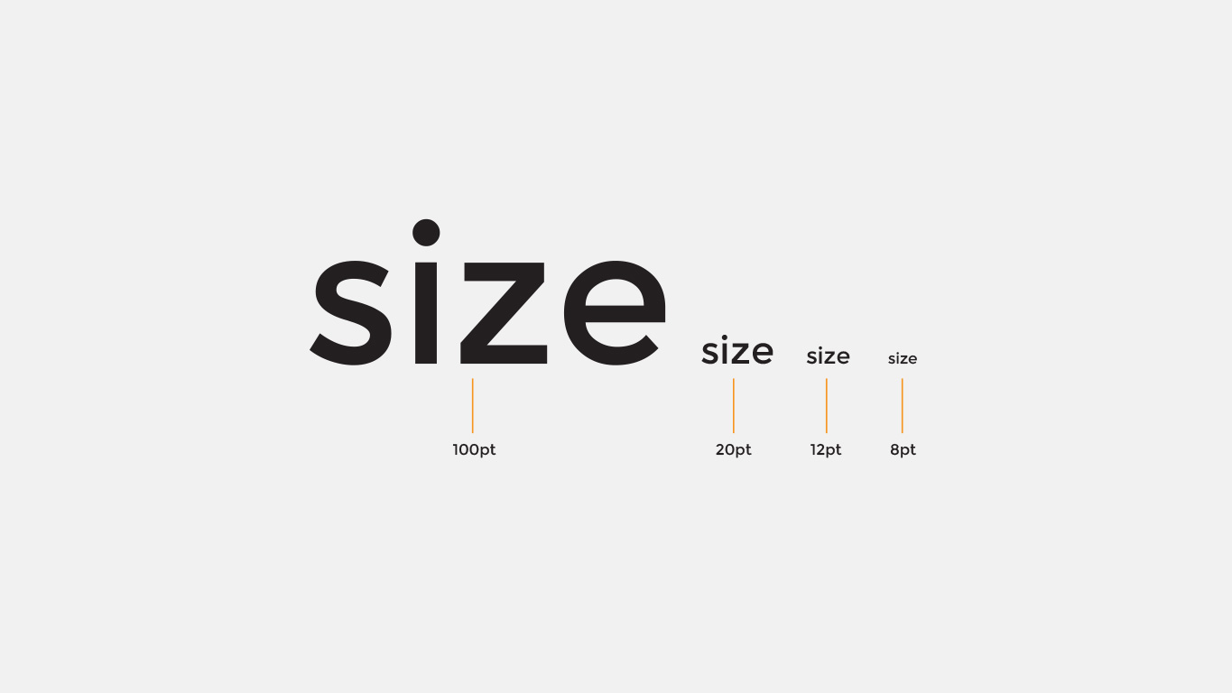
Type size largely determines the legibility of the text, but that works alongside the other factors as well. Having a font too small may visually look nice and minimal and clean. But is it functional? It could deter readers who aren’t interested in squinting at their page or screen, struggling to make sense of the letters. Of course, size is also affected by the typeface. Point 8 in Helvetica appears smaller than point 8 in Verdana. So experiment and choose the right size for the typeface you are using.
It’s also important to consider how a type size will work across a multitude of devices, including mobiles and tablets. The number of regular Internet users growing year-on-year alongside the availability of high-speed connections and Wi-Fi. This means more people have Internet access almost anywhere and at any time.
Line spacing
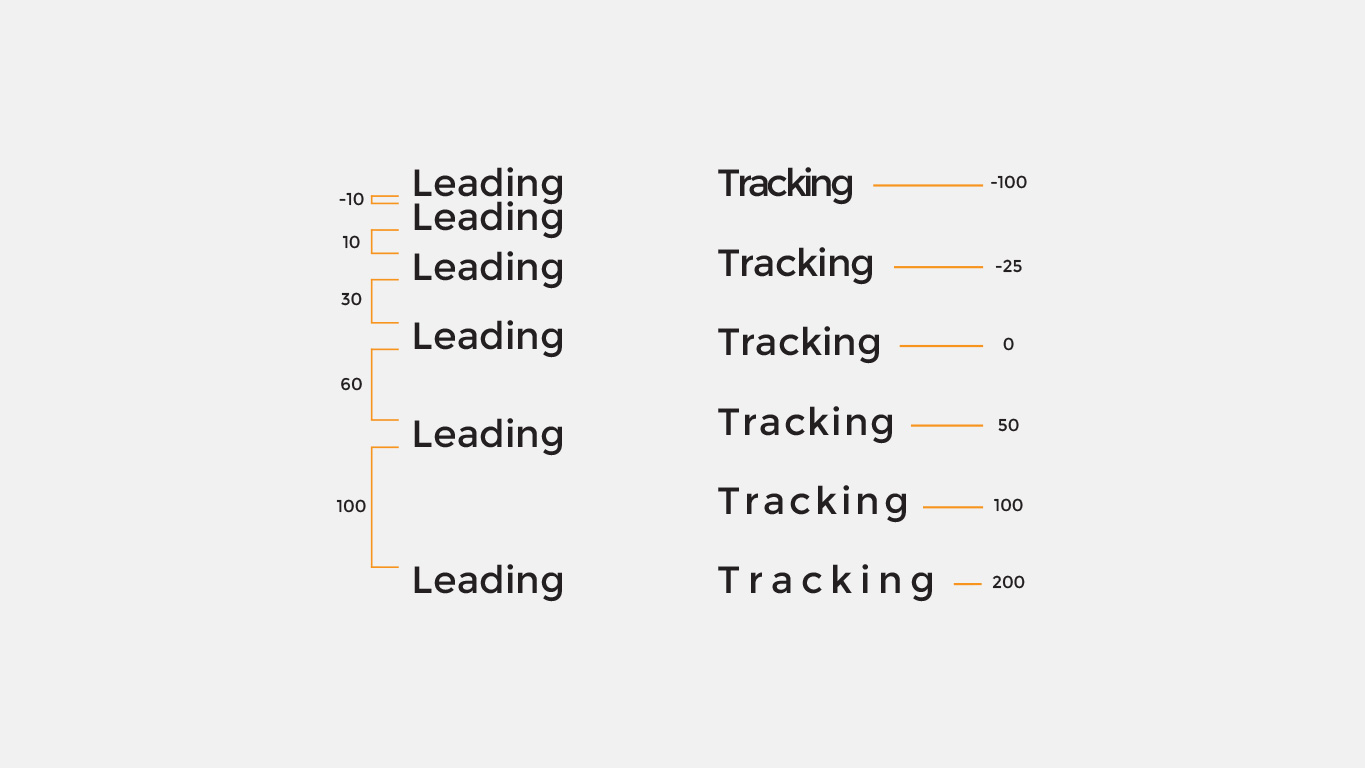
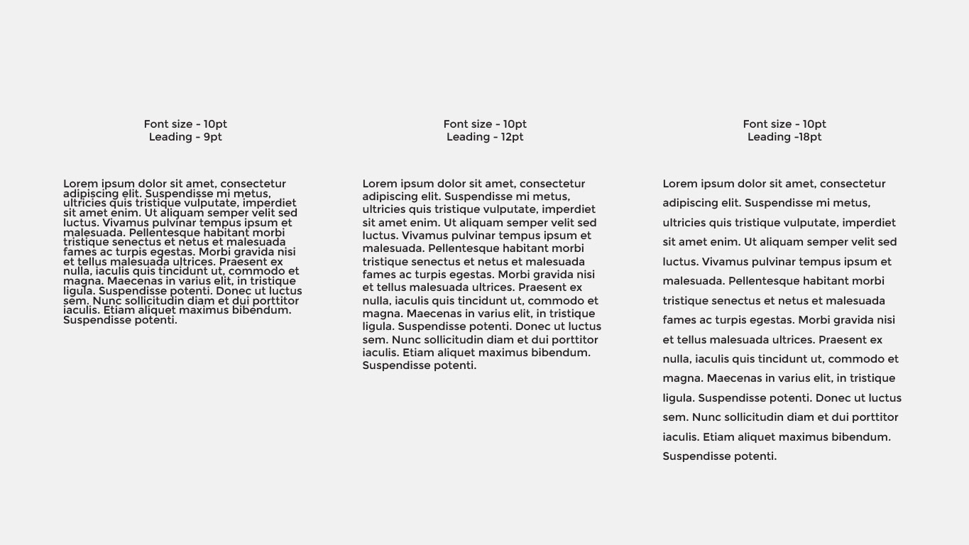
Leading (the vertical space between each line of text), Kerning (the space between two letters/characters) and Tracking (similar to kerning but instead looks at the space between groups of letters within a whole word, sentence or paragraph) are three very powerful tools and have great impact on how a section of text appears visually. Too little or too much leading can make copy harder to read.
Similarly to type size, different typefaces have differing x-heights (distance between the baseline and mean line of lower-case letters in a typeface). A typeface with taller x-heights or much longer ascenders and descenders will often need more leading to help with their legibility.
Alignment
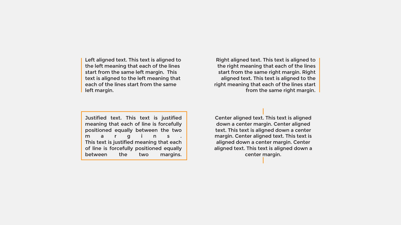
Another fundamental element of typography is type alignment. There are four types of alignment; Center alignment (anchored down the center), Left alignment (aligned to the left hand side), Right alignment (aligned to the right hand side) and Justified alignment (anchored evenly between two lines).
Each has their different uses within design but can greatly alter text legibility. Center aligned text causes readers to work harder to find where each line begins. Without the text being aligned to a straight edge there is no consistent place where users can move their eyes back to when they complete each line, to then continue reading.
Hierarchy
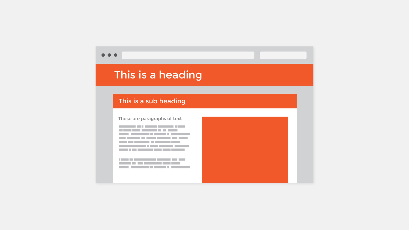
Finally, organizing text establishes an order of importance within your content. It helps the reader know where to look first, helps guide the reader’s eye to the next section and generally helps them navigate through your website or printed material.
Using headings, sub headings and body text is one way to achieve hierarchy. However like everything we’ve discussed above, work together with colour, typeface, etc., to achieve the best overall legibility for readers.
To conclude, there are many fundamentals that create ‘good typography.’ Each element must work with the other to provide a seamless, legible experience for your readers. The most important lesson is to approach typography holistically – how will it look on a website; how will that then look on a mobile phone and what about if it was printed?
If done correctly then good content will set your website or printed material apart from everyone else. Search engines will love it; it’ll reach those you wished to reach, engage them and most importantly will show you that all other components really do play a secondary role.